
In today’s digital age, where users interact with various applications and websites on a daily basis, the significance of user interface (UI) design cannot be overstated. A well-crafted UI not only enhances usability but also plays a pivotal role in shaping user experiences. To achieve this, designers adhere to certain fundamental principles that guide them in creating interfaces that are intuitive, aesthetically pleasing, and user-friendly. In this blog, we’ll delve into eight key principles of UI design that are crucial for crafting exceptional user experiences.
What Are The 8 Key Principles of UI Design?
Certainly, let’s delve a bit deeper into each principle to provide additional insights and examples:
- Clarity: Clarity in UI design encompasses several aspects, including visual clarity, functional clarity, and informational clarity. Visual clarity involves using clear and understandable visuals such as icons, buttons, and imagery to convey information or actions. Functional clarity ensures that every element serves a clear purpose and functions as expected, reducing ambiguity and confusion for users. Informational clarity involves presenting information in a concise and understandable manner, avoiding jargon or unnecessary complexity. For example, a well-designed form should clearly label each field and provide helpful hints or instructions to guide users through the input process.
- Consistency: Consistency fosters a sense of familiarity and reliability, making it easier for users to navigate and interact with the interface. Consistent design elements such as typography, color palette, and layout create visual harmony and reinforce the brand’s identity. Consistency also extends to interaction patterns and behavior, ensuring that similar actions produce similar outcomes across different parts of the interface. For instance, maintaining consistent button styles and placement throughout an application helps users quickly identify interactive elements and predict their behavior.
- Simplicity: Simplicity is about eliminating unnecessary complexity and focusing on what truly matters to the user. A simple interface prioritizes essential features and content while minimizing distractions and extraneous elements. By reducing cognitive load and streamlining interactions, simplicity enhances usability and encourages user engagement. For example, a minimalist dashboard design might display only the most relevant metrics and controls, allowing users to quickly grasp the information they need without feeling overwhelmed by unnecessary clutter.
- Visibility: Visibility refers to the prominence and discoverability of UI elements within the interface. Important features and actions should be easily visible and accessible to users without requiring additional effort or exploration. Visual cues such as color contrast, size, and placement can be used to draw attention to key elements and guide users’ focus. For instance, a primary call-to-action button should stand out prominently against the background, making it clear to users where they should click to proceed.
- Feedback: Feedback provides users with information about the outcome of their actions, helping to confirm that their input has been received and understood by the system. Feedback can take various forms, including visual cues such as animations or progress indicators, auditory cues such as sounds or tones, and textual cues such as confirmation messages or error alerts. Effective feedback not only acknowledges user actions but also provides guidance and reassurance, helping users navigate the interface with confidence. For example, a form validation message can inform users of any errors in their input and provide suggestions for correction, preventing frustration and ensuring a smooth user experience.
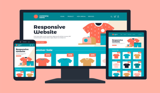
- Flexibility: Flexibility in UI design allows for adaptability and customization to accommodate diverse user preferences and contexts. A flexible interface adapts gracefully to different screen sizes, resolutions, and orientations, ensuring a consistent experience across various devices and platforms. Customization options such as theme selection, layout preferences, and accessibility settings empower users to personalize their experience according to their needs and preferences. For instance, a news app might allow users to customize their homepage layout and content preferences to tailor their newsfeed to their interests and preferences.
- Hierarchy: Hierarchy helps users understand the relative importance and organization of content within the interface, guiding them through the information hierarchy and facilitating easy navigation and comprehension. A clear hierarchy of elements establishes visual relationships between different parts of the interface, making it easier for users to scan and prioritize information. Visual cues such as size, color, and typography can be used to differentiate between different levels of hierarchy, with more important elements appearing more prominently than less important ones. For example, a news website might use larger headlines and bold typography to highlight top stories, while using smaller text and subdued colors for less prominent articles.
- Accessibility: Accessibility ensures that the interface is usable and inclusive for users of all abilities and needs, including those with disabilities or limitations. An accessible interface incorporates features and design patterns that facilitate perceivability, operability, and understandability for all users. This may include providing alternative text for images, ensuring keyboard navigation support, implementing high contrast modes for users with visual impairments, and optimizing content readability for users with cognitive disabilities. By prioritizing accessibility, designers can ensure that their interfaces are usable by everyone, regardless of their individual needs or limitations.
By integrating these principles into UI design processes, designers can create interfaces that not only meet users’ functional needs but also deliver enjoyable, intuitive, and memorable experiences. ChetsApp understands the importance of these principles in creating user-centric interfaces that resonate with users and drive business success. By prioritizing clarity, consistency, simplicity, visibility, feedback, flexibility, hierarchy, and accessibility, ChetsApp aims to deliver exceptional user experiences that delight and engage users across all its products and services.